- MatiralApp, Scaffold widget
- Container, Center widget
MaterialApp Widget
참고 : api.flutter.dev - MaterialApp class (opens in a new tab)
api.flutter.dev - MaterialApp class (opens in a new tab) 에서는 MaterialApp 내의 인자값에 대해서 아래와 같이 설명하고 있습니다.
The MaterialApp (opens in a new tab) configures the top-level Navigator (opens in a new tab) to search for routes in the following order:
- For the
/route, the home (opens in a new tab) property, if non-null, is used. - Otherwise, the routes (opens in a new tab) table is used, if it has an entry for the route.
- Otherwise, onGenerateRoute (opens in a new tab) is called, if provided. It should return a non-null value for any valid route not handled by home (opens in a new tab) and routes (opens in a new tab).
- Finally if all else fails onUnknownRoute (opens in a new tab) is called.
이 외에도 Properties (opens in a new tab) 섹션을 보면 다양한 인자값에 대해 설명하고 있습니다.
home
- 앱을 제일 처음 실행했을 때 진입하는 기본 route 를 home 이라고 이야기합니다.
routes
- 앱 내에서 화면이 이동될 때 이동될 경로를 route 라고 이야기합니다.
color, theme
- color 또는 theme 을 지정해줄 수 있습니다.
- 일반적으로 theme 객체를 지정해서 통일성을 부여합니다.
Scaffold Widget
Scaffold 는 앱을 구성할 때 쓰이는 도화지(캔버스) 같은 존재입니다.
e.g.
import 'package:flutter/material.dart';

void main() {
  runApp(MaterialApp(
    home: Scaffold(
      appBar: AppBar(
          actions: [
            IconButton(
                onPressed: () {
                  print("Pressed!!");
                },
                icon: Icon(Icons.play_arrow))
          ],
          title: Center(
            child: Text('Helloworld App Bar'),
          )),
      body: HelloworldWidget(),
    ),
  ));
}

class HelloworldWidget extends StatelessWidget {
  const HelloworldWidget({super.key});

  @override
  Widget build(BuildContext context) {
    return SafeArea(
      child: Center(
        child: Text(
          'Hello, Flutter',
          style: TextStyle(
            color: Colors.blue,
          ),
        ),
      ),
    );
  }
}
Scaffold 내에 appBar, body 를 추가해줬습니다.
위의 실행 결과는 아래와 같습니다.
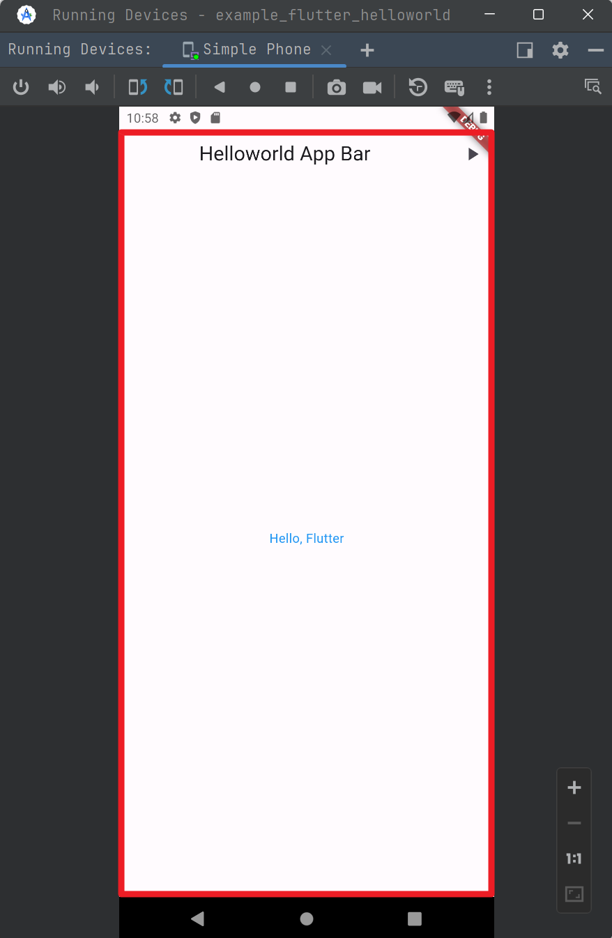
Scaffold 위젯은 위의 그림에서 빨간 테두리에 표시한 영역에 해당합니다. 마치 캔버스 같은 영역입니다.
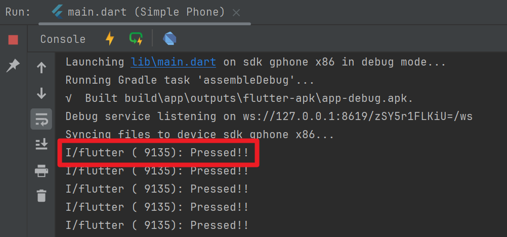
이번에는 우측 상단의 재생버튼을 눌러보시기 바랍니다.
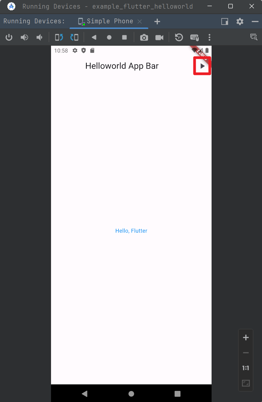
그러면 아래와 같은 문구들이 콘솔에 나타납니다.
Container Widget
먼저 아래의 dart 코드를 작성해주세요.
container_example.dart
import 'package:flutter/material.dart';
void main(){
runApp(MaterialApp(
home: Scaffold(
appBar: AppBar(
title: Text('Study Container'),
),
body: CustomContainer(),
),
));
}
class CustomContainer extends StatelessWidget {
const CustomContainer({super.key});
@override
Widget build(BuildContext context) {
return Container(
width: 300,
height: 300,
color: Colors.amber,
child: Text('Container 영역'),
);
}
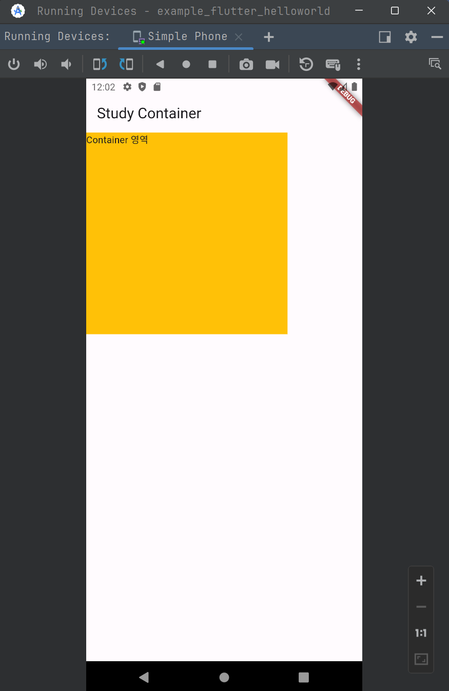
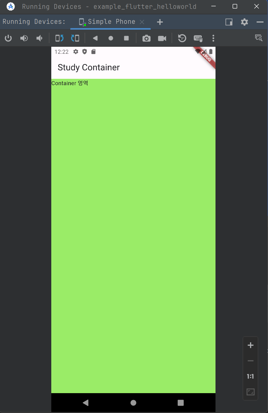
}이렇게 작성한 코드의 결과물을 돌려보면 아래와 같은 결과가 나타납니다. 300x300 사이즈의 컨테이너가 생성되었습니다.
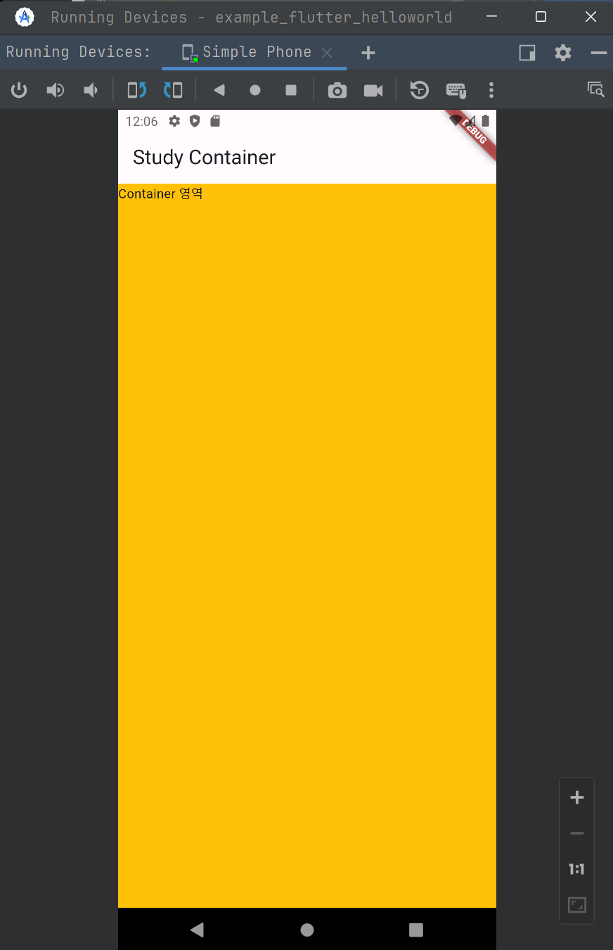
이번에는 컨테이너의 가로, 세로를 모두 채워보겠습니다. 아래의 코드로 수정해주세요.
Container 위젯의 width, height 을 모두 double.infinity 로 지정해주었습니다.
container_example.dart
import 'package:flutter/material.dart';
void main(){
runApp(MaterialApp(
home: Scaffold(
appBar: AppBar(
title: Text('Study Container'),
),
body: CustomContainer(),
),
));
}
class CustomContainer extends StatelessWidget {
const CustomContainer({super.key});
@override
Widget build(BuildContext context) {
return Container(
width: double.infinity, // 변경
height: double.infinity, // 변경
color: Colors.amber,
child: Text('Container 영역'),
);
}
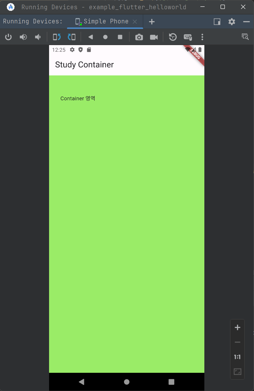
}출력결과는 아래와 같습니다.
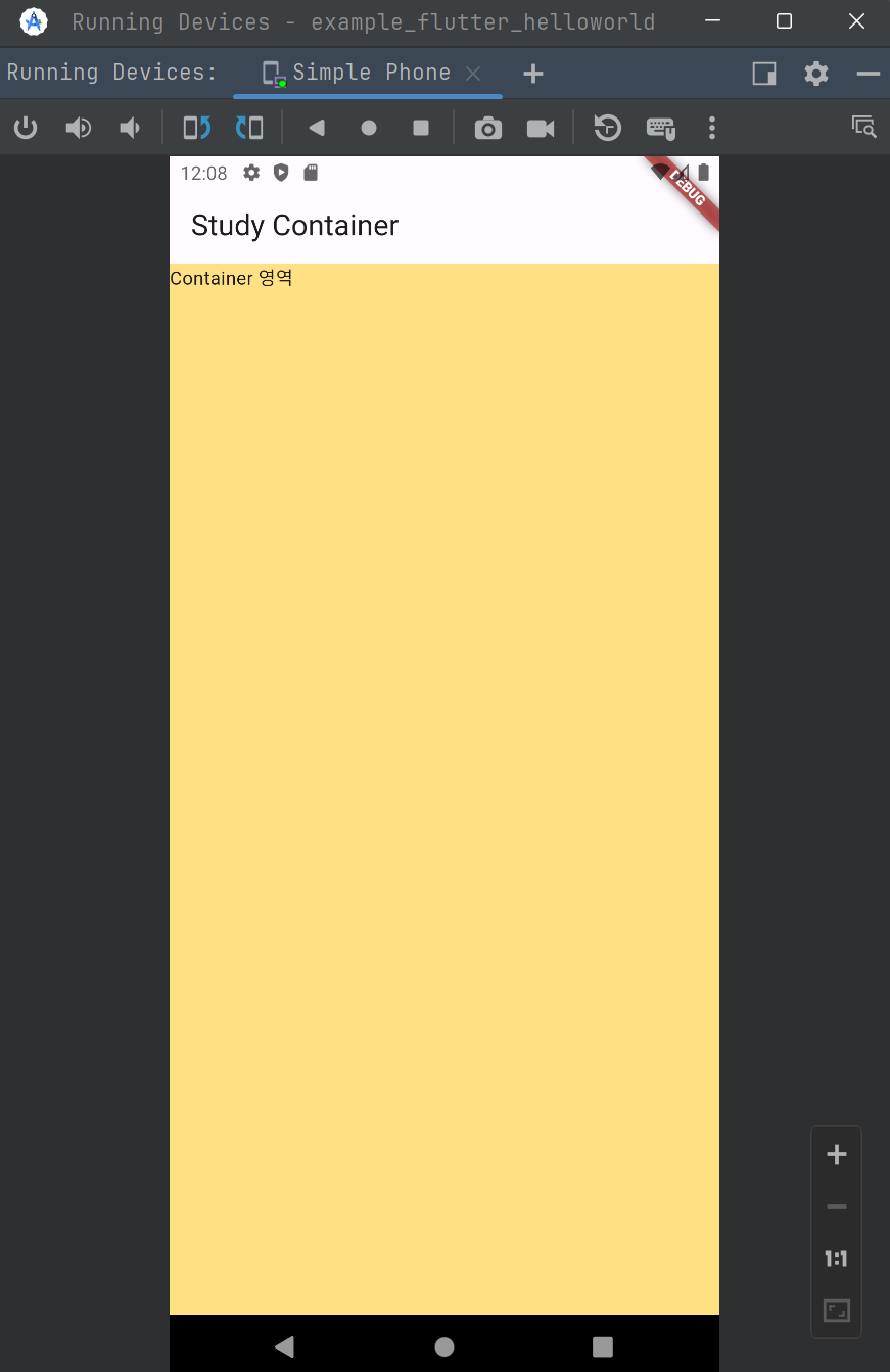
이번에는 배경을 조금 투명하게 만들어봅니다. color 항목에 대해 Colors.amber.shade200 으로 지정해줬습니다.
container_example.dart
import 'package:flutter/material.dart';

void main(){
  runApp(MaterialApp(
    home: Scaffold(
      appBar: AppBar(
        title: Text('Study Container'),
      ),
      body: CustomContainer(),
    ),
  ));
}

class CustomContainer extends StatelessWidget {
  const CustomContainer({super.key});

  @override
  Widget build(BuildContext context) {
    return Container(
      width: double.infinity,
      height: double.infinity,
      color: Colors.amber.shade200, // 변경한 부분
      child: Text('Container 영역'),
    );
  }
}
출력결과는 아래와 같습니다.
이번에는 색상을 직접 지정해줘보겠습니다.
에디터의 왼쪽에 보이는 색상 아이콘을 클릭하면 팝업이 나타나는데, 원하는 색상을 포인터로 선택 후에 Hex 값을 복사합니다.
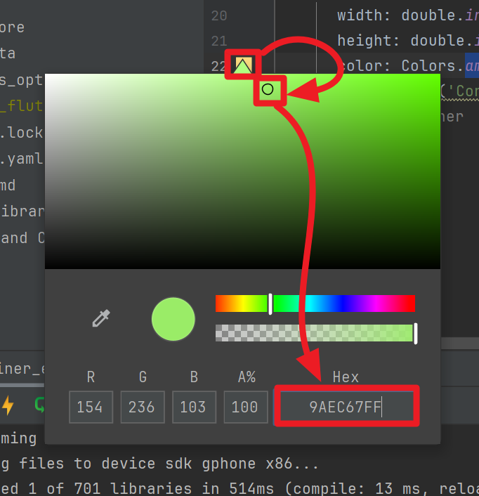
색상 코드를 복사한 후 아래와 같이 코드를 수정해주세요.
container_example.dart
import 'package:flutter/material.dart';

void main(){
  runApp(MaterialApp(
    home: Scaffold(
      appBar: AppBar(
        title: Text('Study Container'),
      ),
      body: CustomContainer(),
    ),
  ));
}

class CustomContainer extends StatelessWidget {
  const CustomContainer({super.key});

  @override
  Widget build(BuildContext context) {
    return Container(
      width: double.infinity,
      height: double.infinity,
      color: Color(0xFF9AEC67), // 여기를 수정했습니다.
      child: Text('Container 영역'),
    );
  }
}
색상 팔레트에서 복사한 값은 9AEC67FF 였습니다. 여기에서 아래와 같이 변경해서 적용했습니다.
-
맨 앞에
0x를 붙입니다 :0x9AEC67FF -
맨 뒤의
FF를 제거합니다 :0x9AEC67 -
0x의 바로 뒤에FF를 붙여줍니다 :0xFF9AEC67
색상 코드의 각 자리수는 아래와 같은 의미를 가집니다.
- 0x[투명도 2자리][Red 표현 2자리][Green 표현 2자리][Blue 표현 2자리]
위의 코드는 아래와 같이 출력됩니다.
이번에는 padding, margin 을 지정해봅니다.
container_example.dart
import 'package:flutter/material.dart';
void main(){
runApp(MaterialApp(
home: Scaffold(
appBar: AppBar(
title: Text('Study Container'),
),
body: CustomContainer(),
),
));
}
class CustomContainer extends StatelessWidget {
const CustomContainer({super.key});
@override
Widget build(BuildContext context) {
return Container(
width: double.infinity,
height: double.infinity,
color: Color(0xFF9AEC67),
padding: EdgeInsets.fromLTRB(30, 50, 30, 5),
child: Text('Container 영역'),
);
}
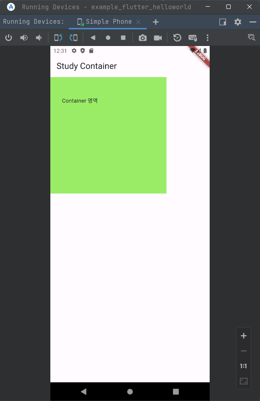
}왼쪽에서 30px, 위에서 50px 의 빈 공간의 간격(padding)을 두고 child 를 배치하게 됩니다. 이 외에도 right, bottom 을 지정했는데, 내용물의 길이가 길지 않기에 넘쳐나지 않게 되어서 이번 출력물에서는 확인은 불가능하지만, right, bottom 에도 padding 을 각각 지정해둔 상태입니다.
이번에는 margin 을 수정하는 코드를 작성해봅니다.
먼저 테스트를 위해 아래와 같이 Container 영역을 줄여주는 코드를 작성합니다.
container_example.dart
import 'package:flutter/material.dart';

void main(){
  runApp(MaterialApp(
    home: Scaffold(
      appBar: AppBar(
        title: Text('Study Container'),
      ),
      body: CustomContainer(),
    ),
  ));
}

class CustomContainer extends StatelessWidget {
  const CustomContainer({super.key});

  @override
  Widget build(BuildContext context) {
    return Container(
      width: 300,
      height: 300,
      color: Color(0xFF9AEC67),
      padding: EdgeInsets.fromLTRB(30, 50, 30, 5),
      child: Text('Container 영역'),
    );
  }
}
출력결과는 아래와 같습니다.
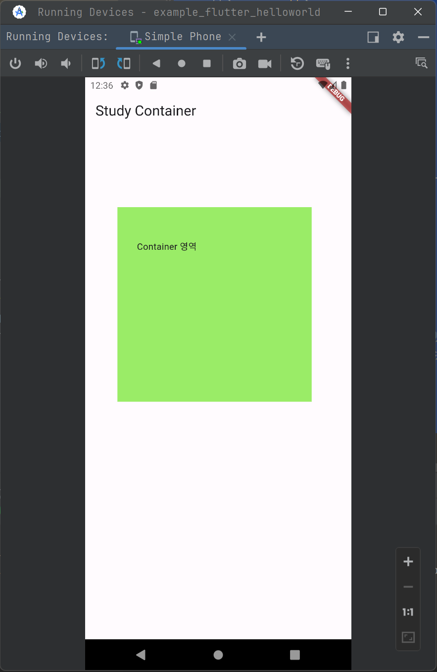
이제 위에 나타난 초록색 영역을 Scaffold 내에서 약간의 간격을 두고 떨어지도록 설정하는 코드를 작성해봅니다. 코드는 아래와 같습니다.
container_example.dart
import 'package:flutter/material.dart';

void main(){
  runApp(MaterialApp(
    home: Scaffold(
      appBar: AppBar(
        title: Text('Study Container'),
      ),
      body: CustomContainer(),
    ),
  ));
}

class CustomContainer extends StatelessWidget {
  const CustomContainer({super.key});

  @override
  Widget build(BuildContext context) {
    return Container(
      width: 300,
      height: 300,
      color: Color(0xFF9AEC67),
      padding: EdgeInsets.fromLTRB(30, 50, 30, 5),
      margin: EdgeInsets.symmetric(vertical: 120, horizontal: 50),
      child: Text('Container 영역'),
    );
  }
}
vertical :120
- 수직(상하) 간격으로 120 의 공간을 배치해서 떨어뜨려 줍니다.
horizontal : 50
- 수평 (좌우) 간격으로 50 의 공간을 배치해서 떨어뜨려 줍니다.
변경된 결과물은 아래와 같습니다.
Decoration Widget
이번에는 BoxDecoration 을 이용해서 경계선과 배경색을 지정해봅니다.
border_example.dart
import 'package:flutter/material.dart';

void main() {
  runApp(MaterialApp(
    home: Scaffold(
      appBar: AppBar(
        title: Text('Study Container'),
      ),
      body: CustomContainer(),
    ),
  ));
}

class CustomContainer extends StatelessWidget {
  const CustomContainer({super.key});

  @override
  Widget build(BuildContext context) {
    return Container(
      width: 300,
      height: 300,
      // color: Color(0xFF9AEC67), // decoration 과 color 는 같이 쓰는 것이 불가능
      padding: EdgeInsets.fromLTRB(30, 50, 30, 5),
      margin: EdgeInsets.symmetric(vertical: 120, horizontal: 50),
      decoration: BoxDecoration(
          color: Color(0xFF9AEC67),
          border: Border.all(
              color: Colors.black, width: 5, style: BorderStyle.solid),
          borderRadius: BorderRadius.circular(20)),
      child: Text('Container 영역'),
    );
  }
}
이 코드의 출력결과는 아래와 같습니다.
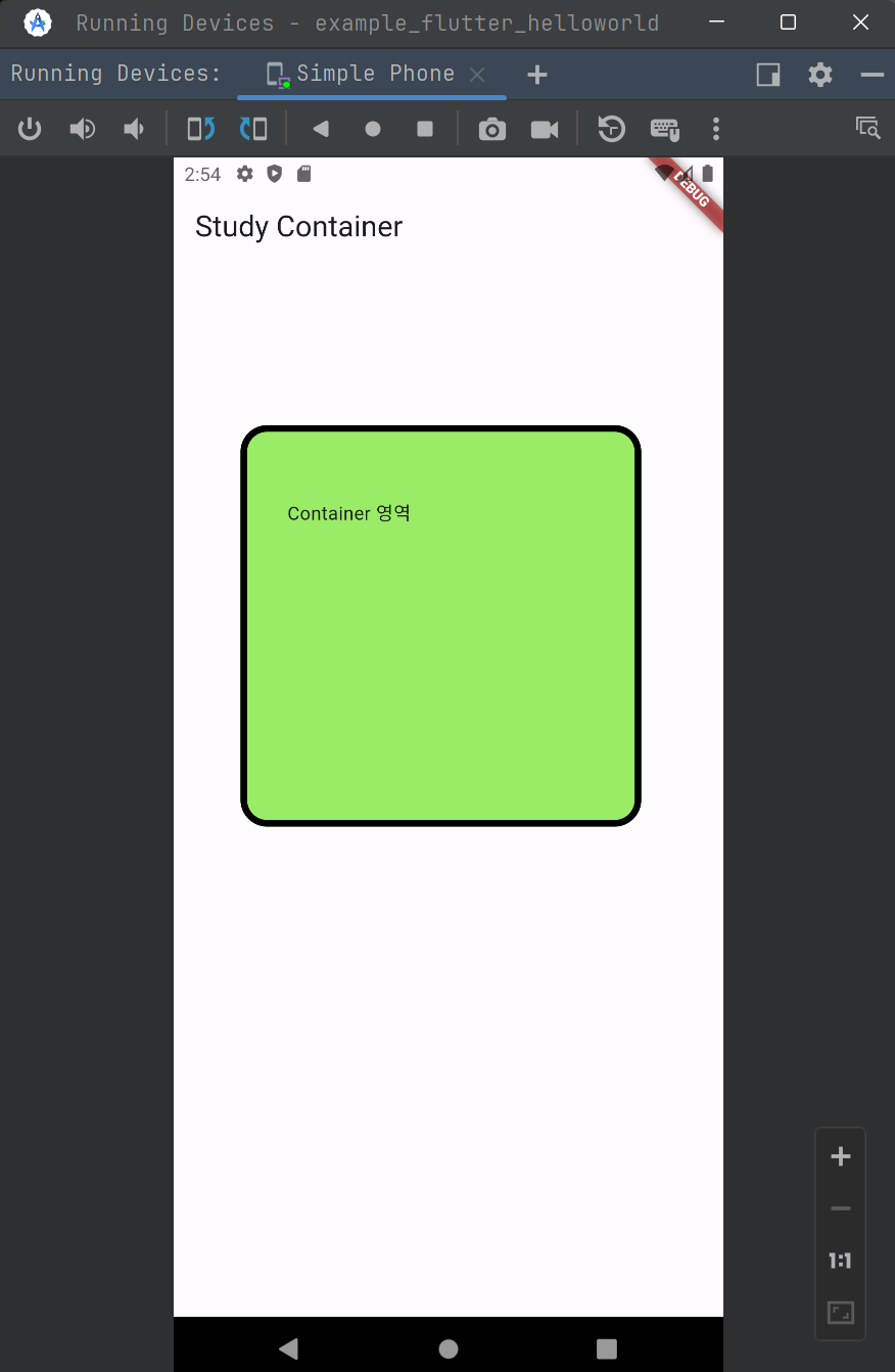
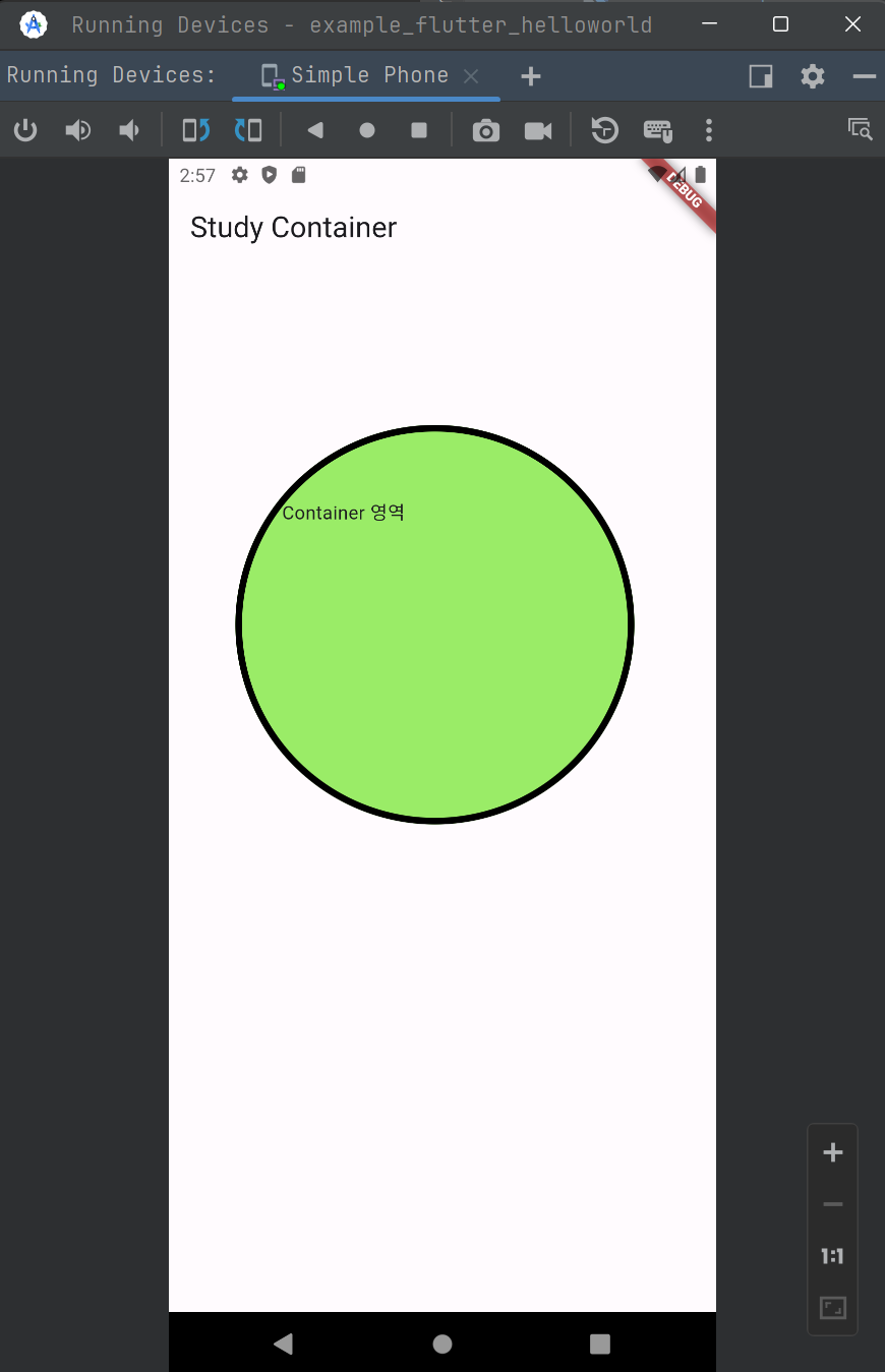
borderRadius값을 200 으로 지정하면 모서리가 더 둥글고 뭉뚝해집니다.
코드를 아래와 같이 수정해줍니다.
import 'package:flutter/material.dart';

void main() {
  runApp(MaterialApp(
    home: Scaffold(
      appBar: AppBar(
        title: Text('Study Container'),
      ),
      body: CustomContainer(),
    ),
  ));
}

class CustomContainer extends StatelessWidget {
  const CustomContainer({super.key});

  @override
  Widget build(BuildContext context) {
    return Container(
      width: 300,
      height: 300,
      // color: Color(0xFF9AEC67), // decoration 과 color 는 같이 쓰는 것이 불가능
      padding: EdgeInsets.fromLTRB(30, 50, 30, 5),
      margin: EdgeInsets.symmetric(vertical: 120, horizontal: 50),
      decoration: BoxDecoration(
          color: Color(0xFF9AEC67),
          border: Border.all(
              color: Colors.black, width: 5, style: BorderStyle.solid),
          borderRadius: BorderRadius.circular(200)),
      child: Text('Container 영역'),
    );
  }
}
출력결과는 아래와 같이 변합니다.
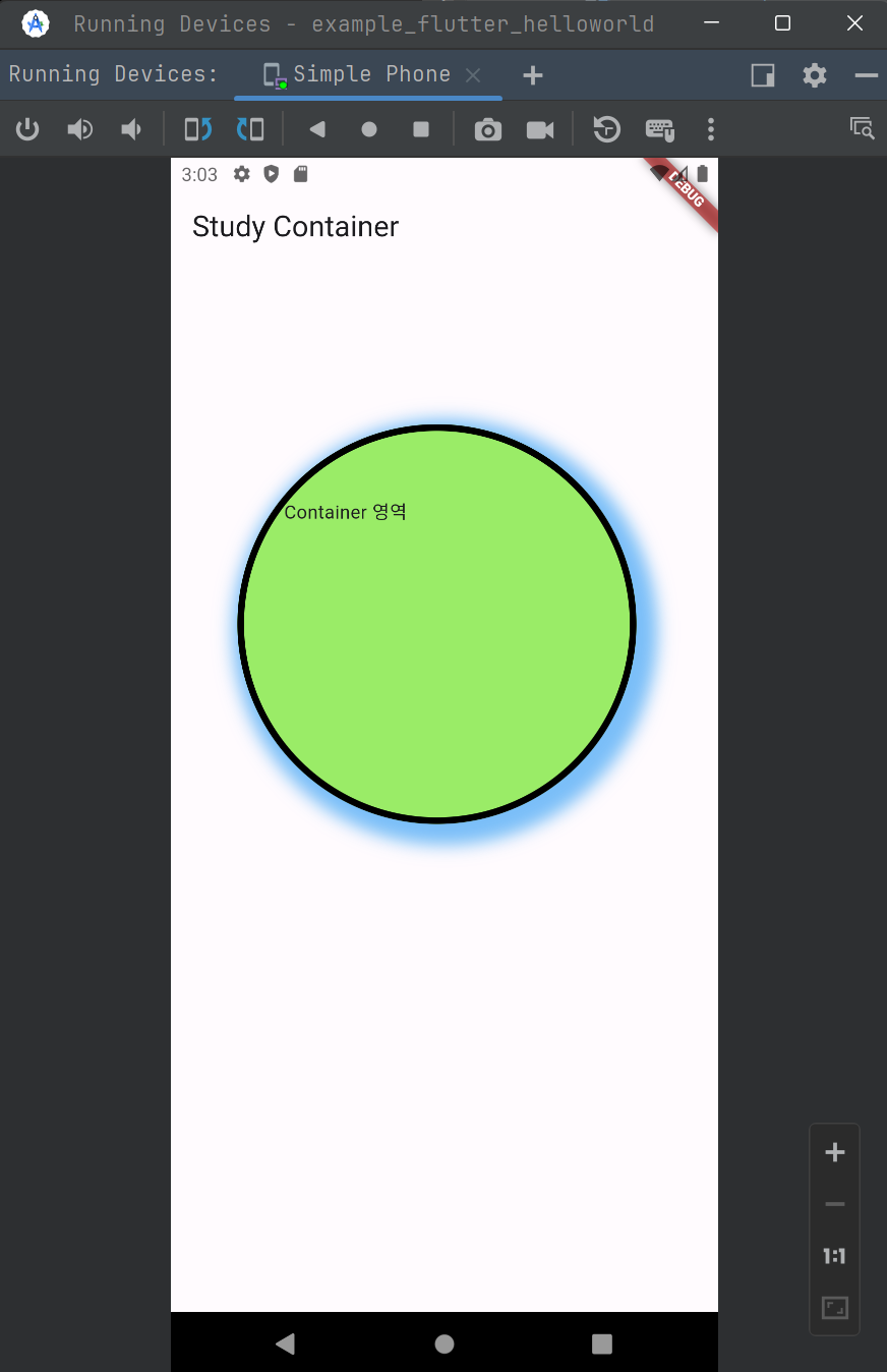
이번에는 그림자효과를 주어봅니다.
import 'package:flutter/material.dart';

void main() {
  runApp(MaterialApp(
    home: Scaffold(
      appBar: AppBar(
        title: Text('Study Container'),
      ),
      body: CustomContainer(),
    ),
  ));
}

class CustomContainer extends StatelessWidget {
  const CustomContainer({super.key});

  @override
  Widget build(BuildContext context) {
    return Container(
      width: 300,
      height: 300,
      // color: Color(0xFF9AEC67), // decoration 과 color 는 같이 쓰는 것이 불가능
      padding: EdgeInsets.fromLTRB(30, 50, 30, 5),
      margin: EdgeInsets.symmetric(vertical: 120, horizontal: 50),
      decoration: BoxDecoration(
          color: Color(0xFF9AEC67),
          border: Border.all(
              color: Colors.black, width: 5, style: BorderStyle.solid),
          borderRadius: BorderRadius.circular(200),
          // (1) 변경된 부분
          boxShadow: [
            BoxShadow(
                color: Colors.blue.withOpacity(0.6),
                offset: Offset(6, 6),
                blurRadius: 10,
                spreadRadius: 10)
          ]),
      child: Text('Container 영역'),
    );
  }
}
위 코드에서 변경된 부분은 (1) 의 영역입니다. boxShadow 속성에 대해서 BoxShadow 객체를 지정해줬습니다. 그림자의 색깔을 따로 지정해주면서 withOpacity(투명도) 를 통해서 투명하게 지정해줬습니다. 색깔을 지정하지 않으면 그림자는 기본적으로 검은색 색상으로 지정됩니다.
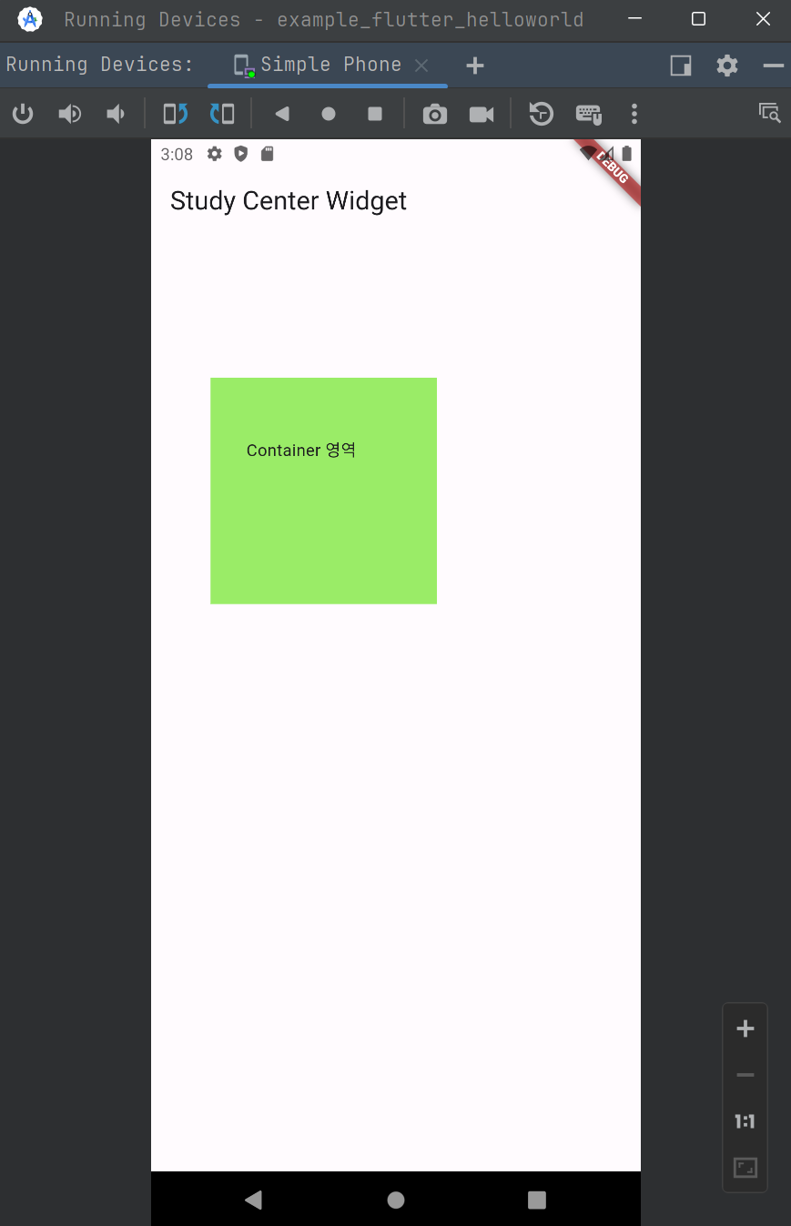
Center Widget
Center widget 은 위젯을 가운데로 배치하는 위젯입니다.
아래와 같은 코드가 있다고 해보겠습니다.
import 'package:flutter/material.dart';

void main(){
  runApp(MaterialApp(
    home: Scaffold(
      appBar: AppBar(
        title: Text('Study Center Widget'),
      ),
      body: CustomContainer(),
    ),
  ));
}

class CustomContainer extends StatelessWidget {
  const CustomContainer({super.key});

  @override
  Widget build(BuildContext context) {
    return Container(
      width: 190,
      height: 190,
      color: Color(0xFF9AEC67),
      padding: EdgeInsets.fromLTRB(30, 50, 30, 5),
      margin: EdgeInsets.symmetric(vertical: 120, horizontal: 50),
      child: Text('Container 영역'),
    );
  }
}
이 코드는 아래와 같이 출력됩니다.
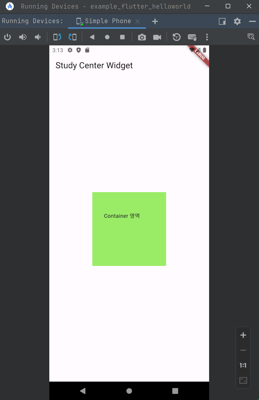
이 위젯을 가운데로 위치시키려면 수동으로 사이즈를 계산해서 margin 을 지정할 수도 있겠지만, Center 위젯을 사용하면 가운데로 위치시키는 것이 가능합니다.
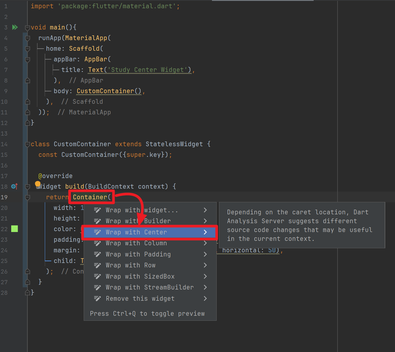
Container 를 가운데로 위치시키기를 원하기 때문에 Container 위젯 위에 마우스 커서를 올려 둔 후 Alt + Enter 키를 누른 후 Center 위젯을 선택합니다.
이렇게 적용된 코드는 아래와 같습니다.
import 'package:flutter/material.dart';

void main(){
  runApp(MaterialApp(
    home: Scaffold(
      appBar: AppBar(
        title: Text('Study Center Widget'),
      ),
      body: CustomContainer(),
    ),
  ));
}

class CustomContainer extends StatelessWidget {
  const CustomContainer({super.key});

  @override
  Widget build(BuildContext context) {
    return Center(
      child: Container(
        width: 190,
        height: 190,
        color: Color(0xFF9AEC67),
        padding: EdgeInsets.fromLTRB(30, 50, 30, 5),
        margin: EdgeInsets.symmetric(vertical: 120, horizontal: 50),
        child: Text('Container 영역'),
      ),
    );
  }
}
Container 위젯이 가운데로 이동한 것을 확인가능합니다.